Electrolux
Revamping the checkout experience, projected to lift completed orders by 31%

In 2024 Electrolux re-architected its checkout to combat high drop-off rates, long load times and an overly long flow all impacting revenue loss. I was responsible for the end-to-end redesign, transforming a multi-step page process into a streamlined one-page checkout, reducing drop-off rates and boosting overall conversion rates.

EOF6P46X
600 SurroundCook Pyrolytic Built-in Oven
In stock
1195 €
Discounts
Subtotal
1100 €
Your cart
1 product
Do you have a discount code?
Enter discount code
Use



The problem
84% abandon the cart & 40% drop off the in the chekout
Electrolux multi step checkout spanning 4 separate steps before completion faced several issues impacting annual revenue loss. The problems are primarily affected for mobile users, which is around 70% of our traffic.
40%
Drop off rates
Analysis showed that around 40% of users drop off during the checkout process.
30s
Load times
The multi step checkout process resulted in long load times exceeding 30 seconds per page.
84%
Cart abandonment rates
Due to long load times the cart abandonment took a huge impact.

soloutiion & highlight
Review, edit and complete purchases all within one page.
A streamlined flow & improved flexibility for maximum transparency. From a 4-step page process to a 1-page checkout, cutting completion time by 45%. Simplified actions, faster load times and giving users maximize control and flexibility with an integrated basket always accessible.
goal
"We want to create a smoth best in class checkout"
During the project kickoff the Product owner shared with me a major objective was to transition the multi step checkout into a smooth best in class checkout. To understand the context better I dug deeper and asked what is defined by best in class, resulting in a clear goal and direction.
Increase conversion rates
Reduce checkout funnel drop off-rates.
Enhance the overarching UX by simplifying and redefining the end-to-end journey.
research
Only about 15% of baskets became orders
Together with the analytics team we looked at the data to better comprehend where customers are facing friction. Just 15% of sessions that added a product ever completed the order, the other 85% left somewhere in between. The steepest loss sat between the basket and the checkout.
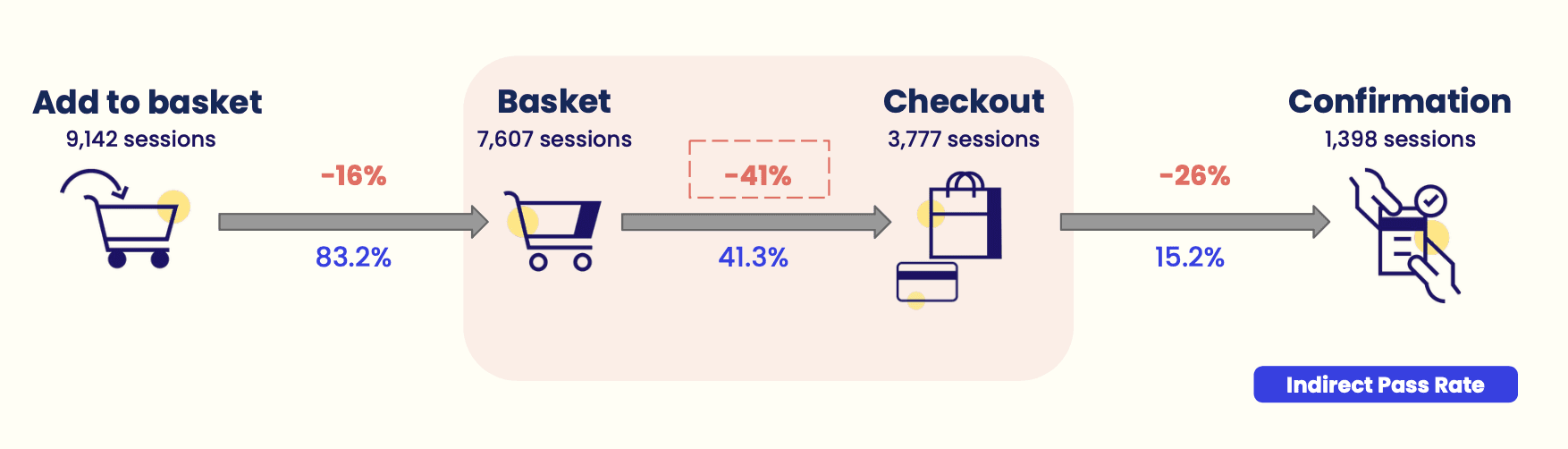
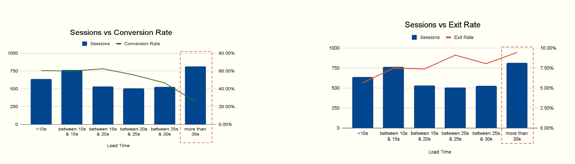
FIG 01 — Drop off rates & load times (Analytics)
41% never reached the checkout
Of the sessions that added a product to the basket, 50% left before the checkout loaded. Of those who did reach it, 63% still didn't finish, with the sharpest fall between the delivery address and delivery method steps.
15% of checkout users went back to the basket and only 17% of them ordered.
They returned to change something in their order, because the checkout pages had no way to edit it. The trip back cost most of them the purchase.
Load times above 30 seconds doubled the exit rate
Conversion fell steadily as pages got slower, and the slowest bucket had the highest exits
The only way back to the cart is out of the checkout
Auditing the checkout from a shopper's perspective surfaced several sources of friction linked to potential drop-off and cart abandonments:
The order can't be edited in the checkout
Once shoppers reached the basket page, they couldn't change quantities, remove items, or swap products. Adjusting anything meant leaving the checkout entirely and starting over from the basket.
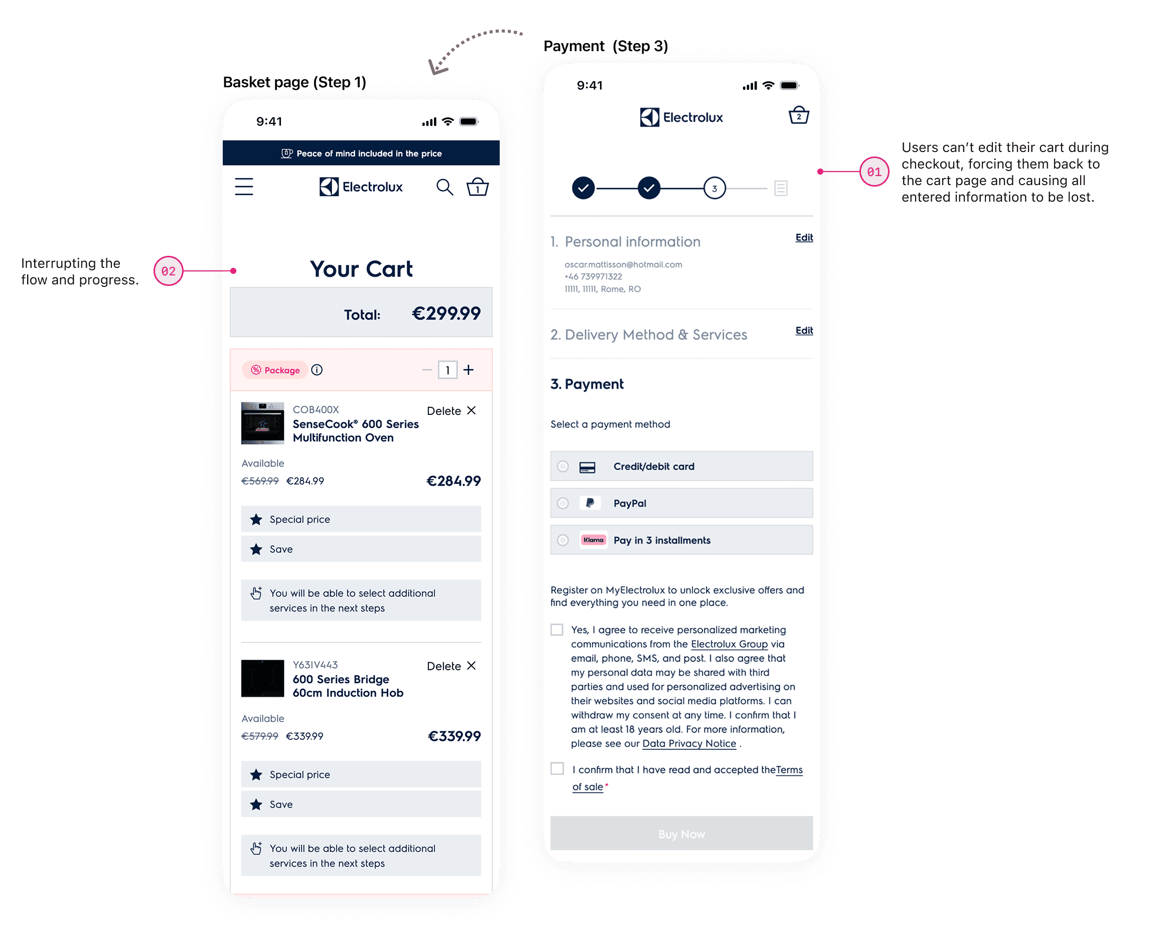
Checkout: Basket page & payment step
An overly long process causing high cognitive load
The checkout process consists of 4 pages, each loaded with information and decisions. The more there was to process, the harder each step became to finish.
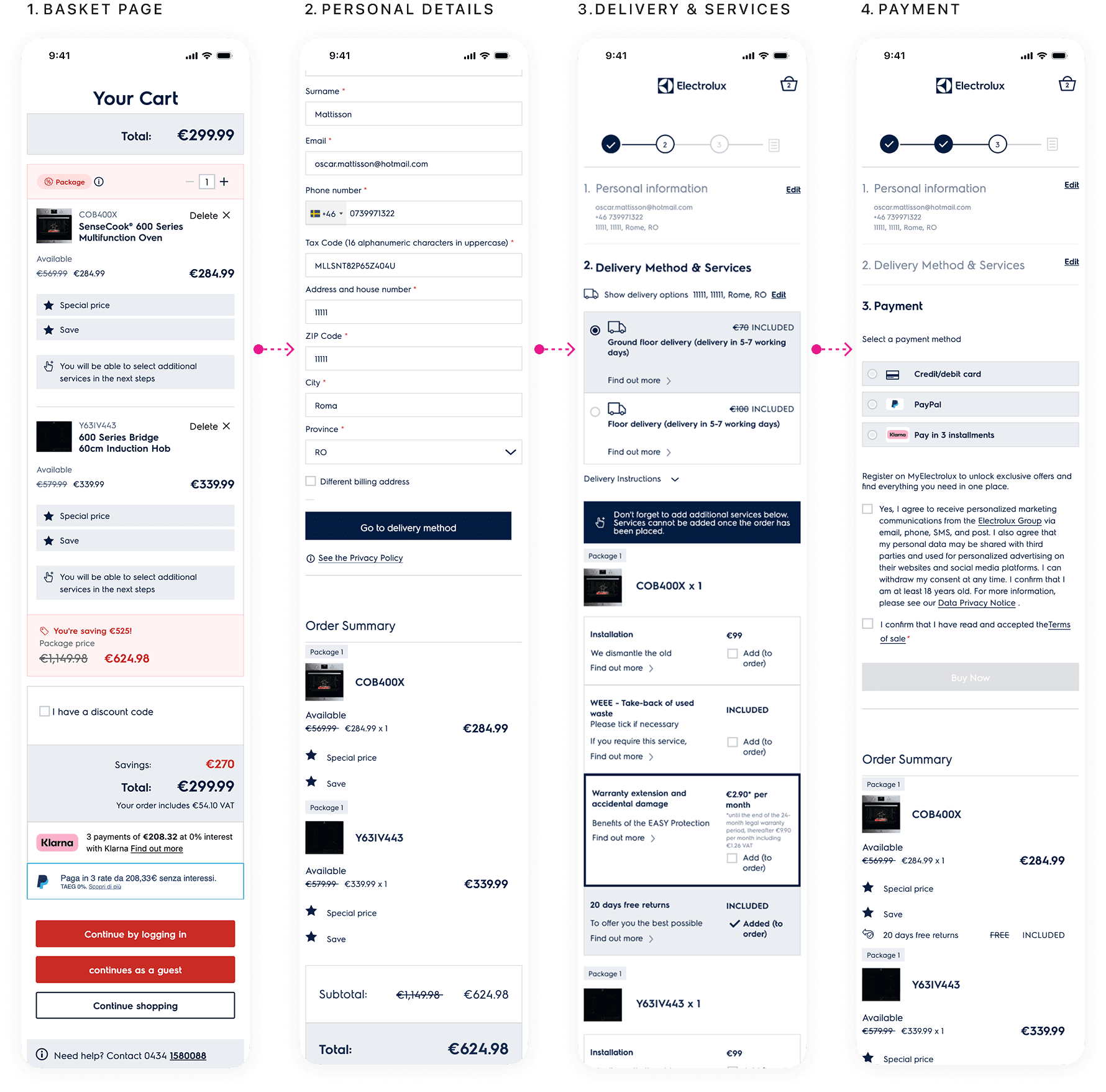
Checkout: Current user journey, 4 step process
Services users already paid for requires manual selection
Services already covered by the price weren't pre-selected and went unexplained. Customers missed them, driving up support inquiries. Moreover services lack clear value proposition, the page have inconsistent display options and poor information hierarchy.
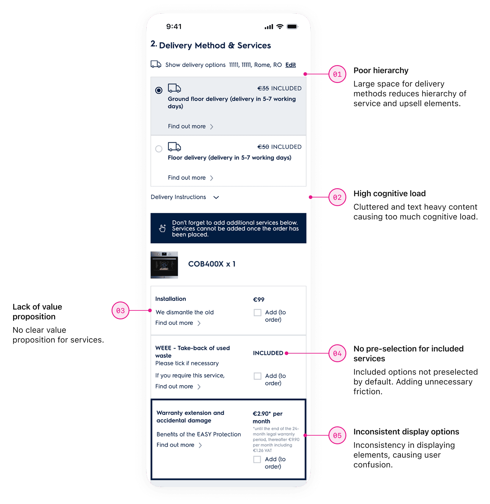
Checkout: Basket page & payment step
Key insight: The analytics showed 15% of checkout sessions returning to the basket. The audit showed the flow leaves consumers no other way to change an order. That's a plausible explanation. I took it into testing as a hypothesis.
The industry patterns
To address the 40% drop off, I analyzed 5 direct E-commerce competitors to identify industry standards for streamlined checkout experiences. Competitors utilizes address autocomplete for faster completion and reduced friction and only display the necessary information at the relevant times. Many top competitors also use multi-step flows, but allow users to edit basket details e.g: quantity, removal of products without forcing them back.
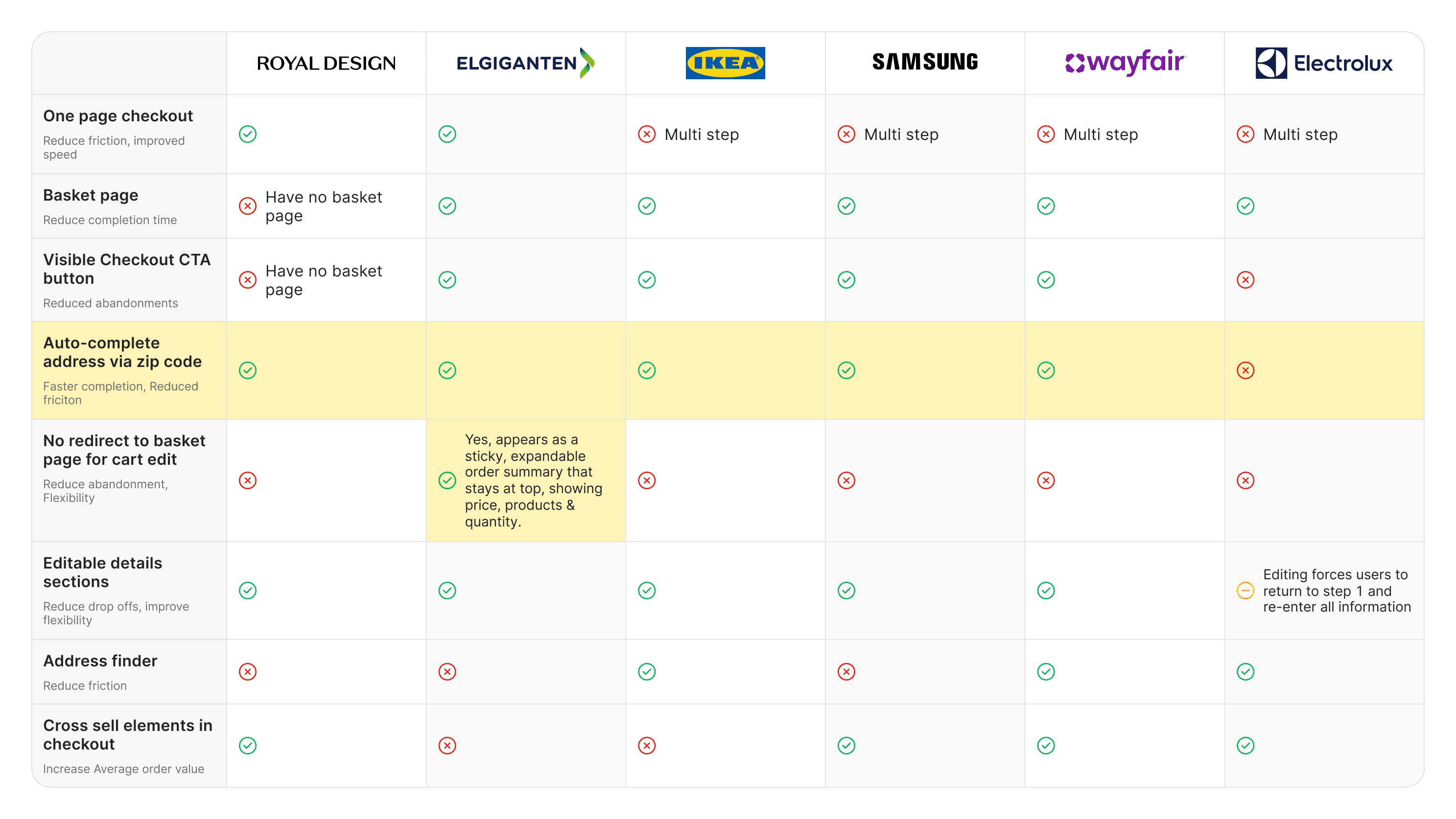
Competitor analysis
Key insight: One major finding was the ability to edit the order during the checkout process without the need to return to a basket page or a previous step in the checkout. This was a key insight that I wanted to further explore how it could be utilized within the flow.
Design
Challenging the status quo – one page instead of four
I challenged the necessity of a dedicated 'Basket Page' entirely. Since 15% of users were returning just to edit quantities. That raised a harder question: does a separate basket page need to exist at all? Removing it would take a full step out of the funnel.
Hypothesis
If users can edit their order inside the checkout flow, they won't need to leave it. The basket page is where 15% of checkout sessions went and most of them never came back.
So I explored two different options:
Pre basket flow – Retains a distinct pre-step basket page
Goal: keep a dedicated review step before checkout.
Trade-off: familiar and lower risk, but it preserves the detour.
Integrated basket flow – Merges the basket into the checkout
Goal: remove the reason to leave the checkout at all
Trade-off: removes a step from the funnel, but only works if users find editing where it now lives.
From two opinions to one flow
I took both to the product owner, arguing for the integrated version, the basket page was where 15% of checkout sessions were going, and keeping it preserved the detour we were trying to remove.
The removal of the basket page was a huge change, it would mean new code logic from both front and backend. Because of this they weren't ready to commit removing this pre basket step at this stage, so we agreed to create both for validation. The following overarching goals I had in mind:
Improve flexibility
If users can easily edit their orders during checkout, they will feel more in control, leading to fewer abandonments and higher completion rates.
Empower with autofill
Implementing smarter autofill in forms, users will spend less time on manual input, reducing friction and improving checkout speed.
As the flow had been somewhat defined I started improving what actually mattered
Minimizing manual input & simplifying the process
I focused on minimizing manual input for postal retrieval and creating a stronger sense of progression by collapsing completed content as users moved through the checkout.
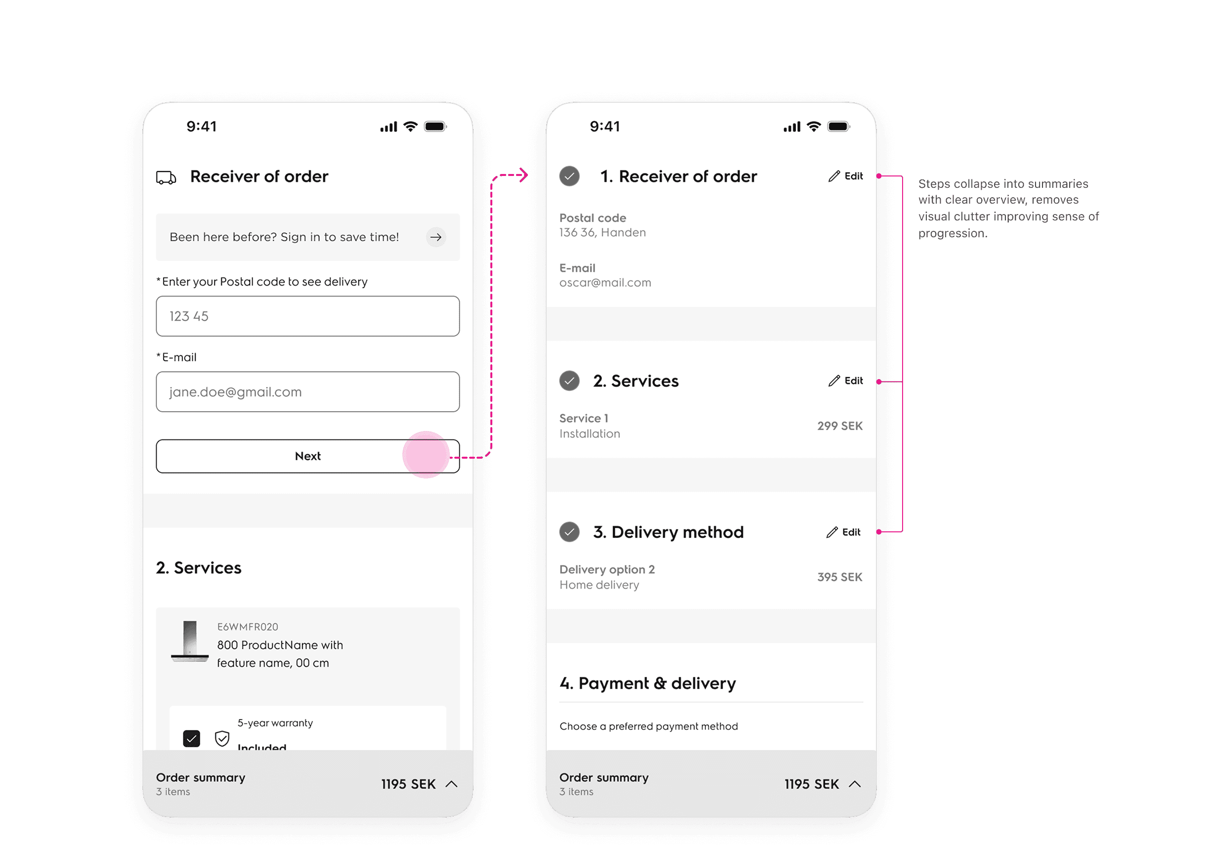
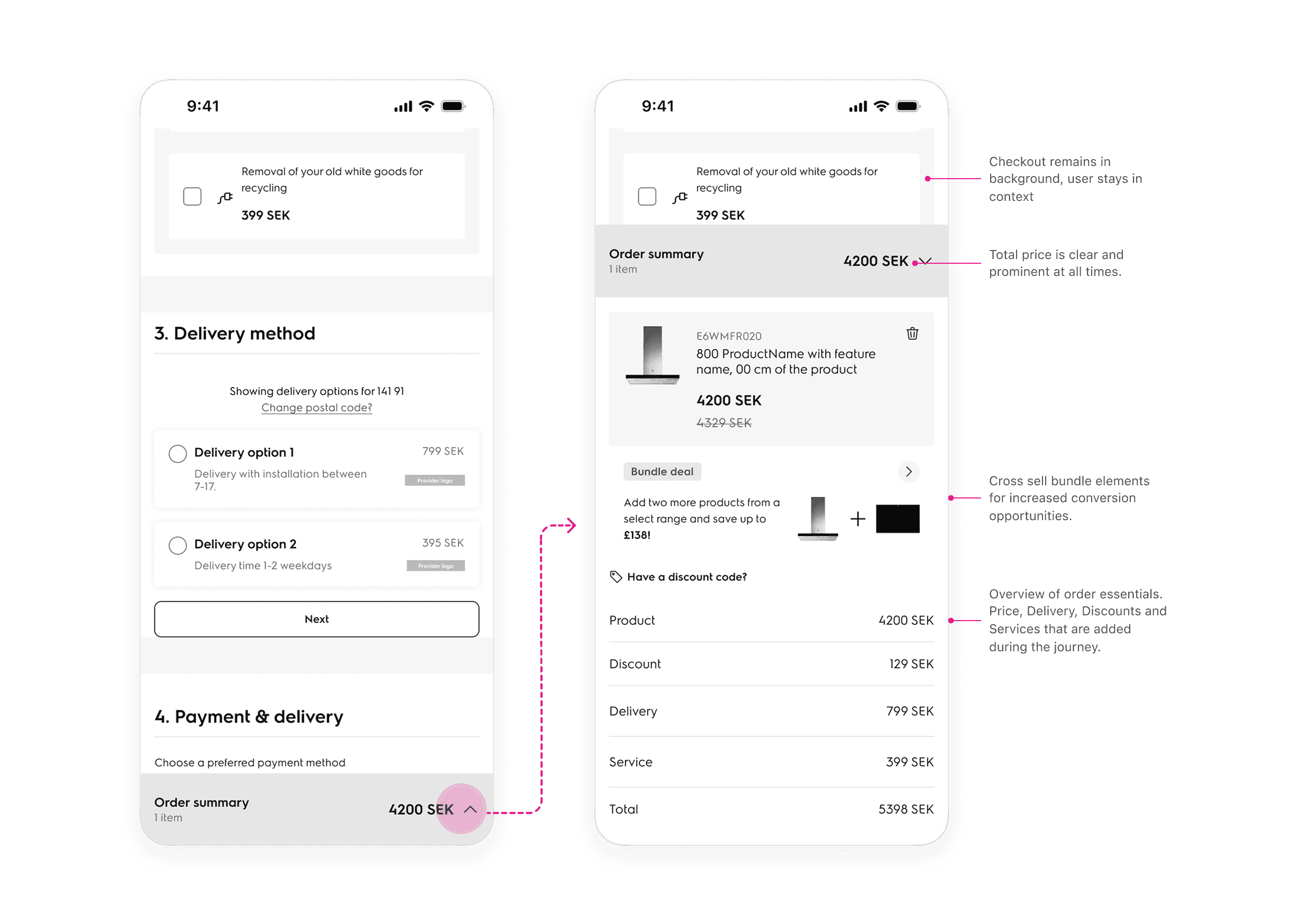
Improved flexibility – order summary always accessible
I integrated a bottom drawer containing the users order allowing tracking price, products and flexible edits all in and part of the checkout flow without the need to return to a basket page.
testing
From assumptions to proof
Given the short timeline it was still important for me to validate the assumptions. I want to ensure we are solving the right problems, the right way. I created a prototype and put it in the hand of the users.
Despite having an established vision with stakeholders, it's a design that had undergone radical changes from a multi step process to now only being a one page. As a result I was able to uncover some further pain points that led me to iterate the design optimizing the flow further.
Making changes based on feedback
Removal of basket page
Testing both flows showed the pre-basket version added a step without adding value. The product owner and I agreed to drop it.
The order summary moved to the top
Placed at the bottom, users scrolled past it. At the top, instantly improved discoverability and preventing from obscuring their view.
Removed collapsible steps
Pressing "Next" after every section was tedious in testinga I pivoted to a progressive disclosure model so content and fields appear as they're needed, so the flow keeps moving.
Adding more clarity
All findings led me to reprioritize both the hierarchy and major functions in the checkout process. This was done in close collaboration with engineers to validate feasibility and API constraints. After rounds of technical discovery the following improvements were made:

Improvements
01
02
03
04
final design
One page, one field, one click
Four pages became one. Removing the loads between steps, filling the address from a postal code, and pulling saved details from Apple Pay, Klarna and PayPal brought the whole order down to a single field and a single click.
Completion time
1m:40s
Pages
1
Form fields
1
Clicks to complete
1
The changes behind the numbers
Beyond the heavy lifting from a new back end logic, there are three changes that make the single page workable. Cart edits available at any point, content that appears only when it's needed, and a payment step that streamlines smart autofill features. All to streamline the flow and make the journey seamless.
Improved flexibility
Expandable order summary for flexibility
Expandable on any step, so users can review, edit quantities and apply discounts without leaving the flow. This is what closed the hypothesis: the reason to go back to the basket page no longer exists.
Reduced cognitive load
Content appears as it's needed
Each step reveals only what's required to complete it, so the page never presents everything at once.
Reduced manual effort
Fast checkout, fewer taps
Apple Pay, Klarna and PayPal pull stored details straight into the flow, which is what makes the one-field, one-click best case possible
Scalable & responsive
Simultaneously I designed with desktop in mind. Following the same streamlined experience users have their order summary as a sticky element on the right side giving a clear overview at all times when adding services, delivery or other add-ons.


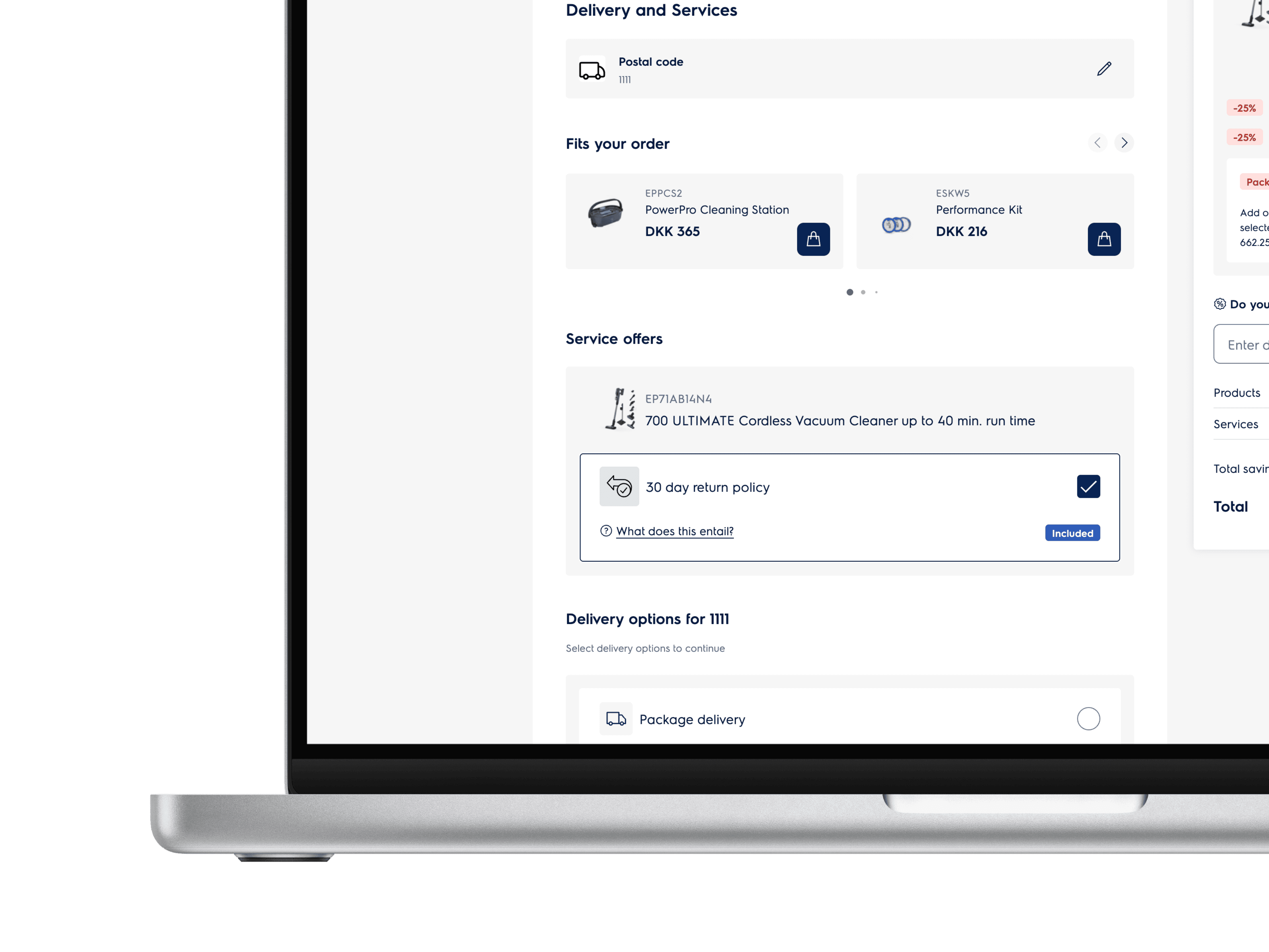
results
After 3 months being live we've seen great impact:
EOF6P46X
600 SurroundCook Pyrolytic Built-in Oven
In stock
1195 €
Discounts
95 €
Subtotal
1100 €
Your cart
1 product
Do you have a discount code?
Enter discount code
Use
Cart abandonment reduced, 84% to 79%
Early estimates put cart abandonment dropping from 84% to 79%. That is 5 percentage points, or 31% more completed orders.
Your cart
1 product
1100 €
Pay now
Payment
Klarna
Trustly
Credit card
+3
45% reduced completion time
Comparing the new flow with the older 4 step page process, time to completion is marginally better. Four pages became one, with fewer fields to fill and fewer steps to click through.
Increased revenue
With the improvements we estimate a significant uplift in annual revenue due to faster load times, less steps and increased flexibility.
refelction
Road ahead and what's next
The checkout is live, so the funnel I started with can be measured again and the flow as shipped is worth putting in front of users to find what the MVP scope left behind. If I could do it all over again, I’d push harder for alignment and testing earlier.
What I would've done differently
More usability testing, earlier, particularly on the final stages before it went into production. As an external consultant I wasn't always in the room when decisions were made, which made it harder to test the reasoning behind them as early as I'd have liked.
Working under constraints
This was a technical project with tight limits. The hardest part was narrowing a long list of pain points down to what was feasible and still meet the business goals inside an MVP release.