Internal pages
Improved flow and increased efficiency for employees internal software tool.

Visma Proceedo
•
2023
Overview
Visma Proceedo is a B2B company, optimizing procurement processes for businesses. Their solutions cover various aspects of the procurement lifecycle, including requisitioning, supplier management, contract management, purchasing and invoicing.
As a UX Design intern, I was the sole UX designer leading this project and continuously received support from the company's UX–lead, Nina. During ten weeks I initiated a product discovery on the internal employees admin pages to improve the product and experience.
My Role
UX/UI Designer
Timeline
Apr - Jun 2023
Team

+1
1 UX designer, 1 UX Lead
Skills
UX/UI Design, User Research, Usability testing, Prototyping
summary
Background
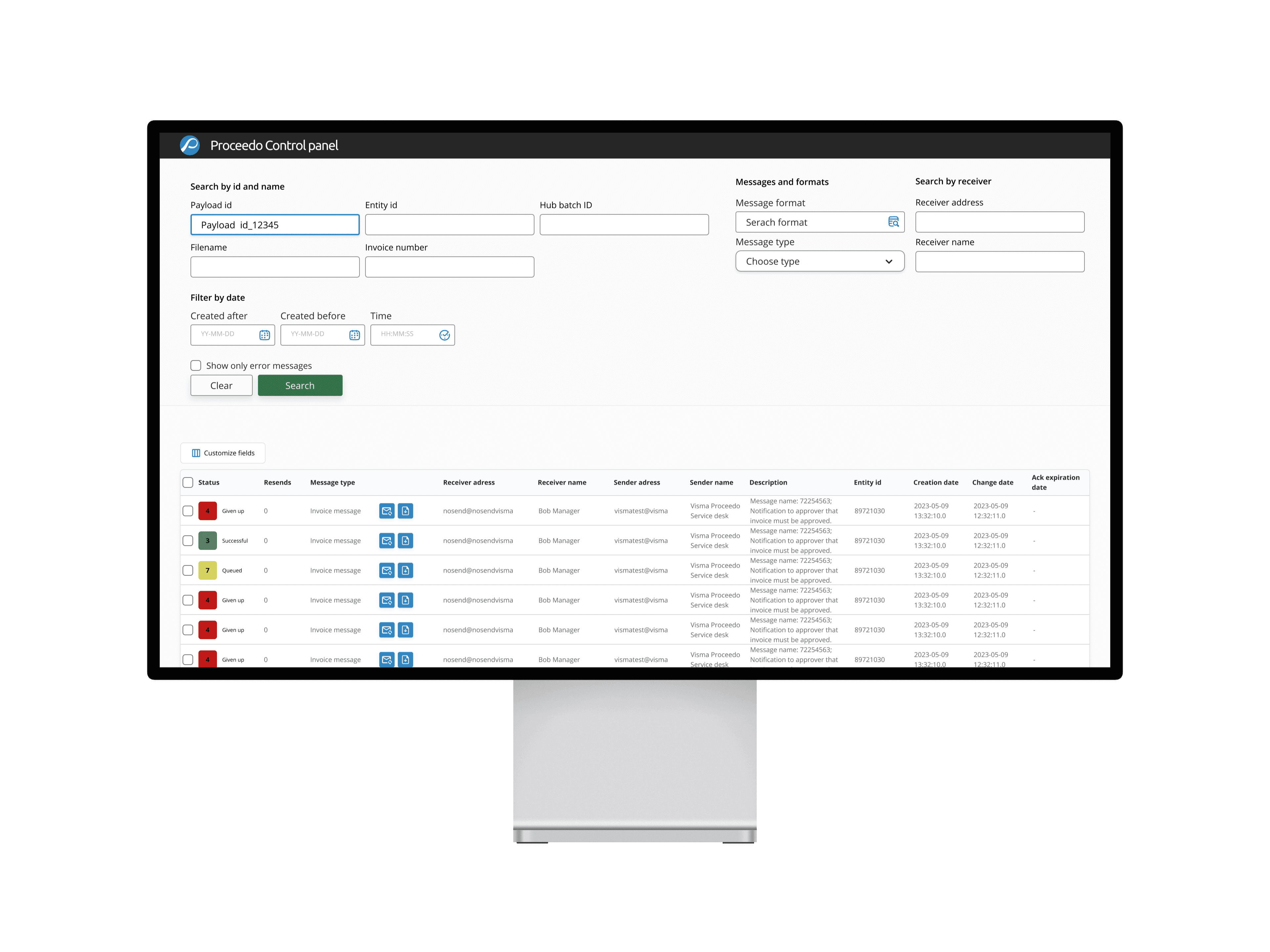
The internal pages are part of an admin tool used by integration specialists and technical support teams to manage transaction issues for Proceedo’s customers. These users rely on the tool to download files, resolve system errors, and resend messages or files as needed. At the core of the interface is a data table—key for locating and handling specific transactions efficiently.
A tiresome process
Users find the page tiresome and annoying to use due to a long flow and many clicks before they can make a resend of a file or retrieve the file they are handling in a desired format.
Handling files is a tedious process
Resending and downloading messages and files is tiresome.
Too many clicks
Users needs to do a lot of clicks in order to finish their task.
Outdated work environment
goals
Increase work efficiency for employees
Make it easier to handle messages and files
Increase utilization of the page
To achieve this I’ve followed the double diamond process. I've conducted user interviews to gather insights to the problem, which were then synthesized to define a problem statement to design towards. I continuously validated and tested different concepts to ensure it aligns with the user's needs.

highlights
A streamlined flow for smarter efficiency.
Optimized the resend and download process which when developed would reduce handling times by 45% compared to the current flow. Increased versatility and customization through filtering options boosting work efficiency. Redesigned the UI to create cohesiveness resulting in fewer clicks, a more intuitive page and navigation structure.
Enhancing efficiency with drawer navigation
Drawers prevents the user being sent to a new page. A clear overview is shown of the page and the file users are handling, which supports efficiency instead of having to go through several pages.


File downloads directly on the page
Download files directly on the page through a new download feature. Files no longer has to be sent to users personal E-mail to retrieve a file in a specific format.
Filtering options for enhanced efficiency and customization
A new feature was added for customizing and sorting table columns.
This support the users to personalize their workflow, reducing unnecessary information and minimizing overflow.
Users can adjust order and show and hide columns easily that are not utilized and suited toward their needs. This creates a more efficient overview for users and reducing cognitive load.

process
Uncovering insights
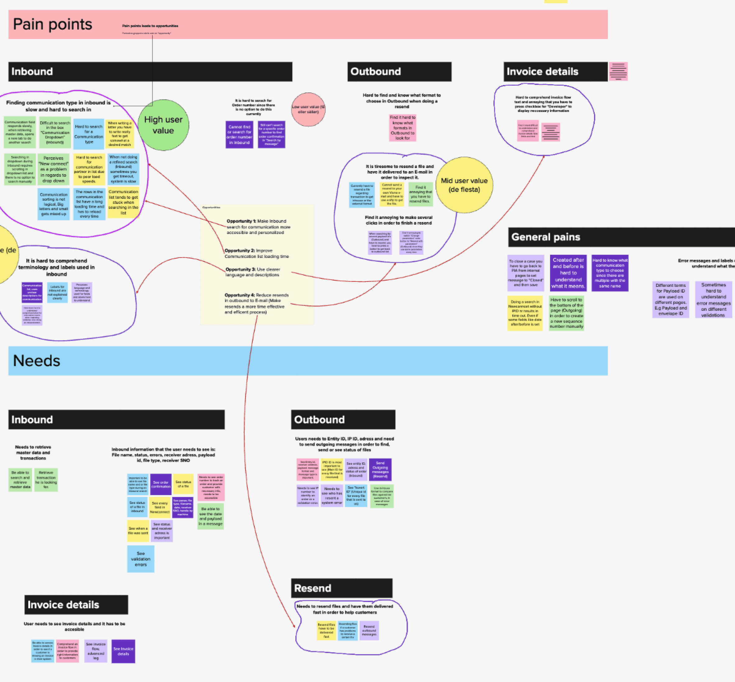
I kicked off a meeting with the product manager to understand how the internal pages support Proceedo as a company. Having some context I conducted 7 user interviews with integration specialists and technical support employees to gather insights about their experiences working with the internal pages, what are their main tasks and goals, what problems exist in their day to day life, and how that affects their workflow.
To identify this I asked them questions below to find patterns and what different needs exist and what is important to them. I then organized my data through affinity mapping in order to find patterns, themes and create categories for different opportunities.
Research questions
What are you mainly using the page for?
What is important to you whilst working with the internal pages?
Is there anything that you find complicated or easy working within the internal pages?
How could the internal pages better support your workflow?
Could you show me the process you go through when using the internal pages?

So, what does the process look like?

Digging into the data revealed several problems
Based on the trends in my affinity map, I’ve noticed how users complain about the file download process. In order to download a file the users has to resend it to their personal email in order to receive it in a desired format. Users also found it tiresome to resend messages through the current flow due to an unnecessary long flow and many clicks. Another finding I did was that some users found it hard to scan through the table when they made a search for a message or a file.
Users find it hard navigating in the table fields due to many columns.
It is tiresome to resend files and have it delivered to an E-mail.
It is annoying to make several clicks in order to finish a resend.
How can I simplify file retrieval and streamline the process of resending files and messages?

ideation
Streamlining a complex flow
I reimagined the user journey due to its complexity and users pains regarding the excessive flow. My primary objective was therefore to streamline the process and significantly reduce its length to help users address resends and downloads in a more efficient and faster way. This was done through a side drawer.


A view that suits different needs
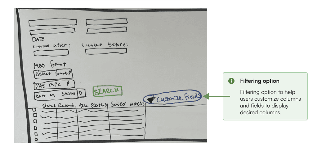
I noted that users with different job roles use the table information differently. This led me to explore, how can I create a versatile view that caters to diverse user needs? As a solution, I began exploring the concept of enabling users to be able to filter columns based on their needs.

Validating hypothesis
At this stage I validated my hypothesis and concept with users through a quick guerilla testing. After the test the users found the customization option as a supportive tool for their workflows. The drawer was perceived as a better way to handle a file. Whilst not everything was clear I addressed the pain points going into the Wireframing before testing the concept.

Wireframing the solution
Based on the above problems identified, I worked towards addressing these pains by coming up with potential solutions.
Structured search form
To enhance the overall interface of the product I structured up the search form that is used when searching for a file. I structured the fields by categories, e.g grouping fields when searching for Address, Id's or formats.
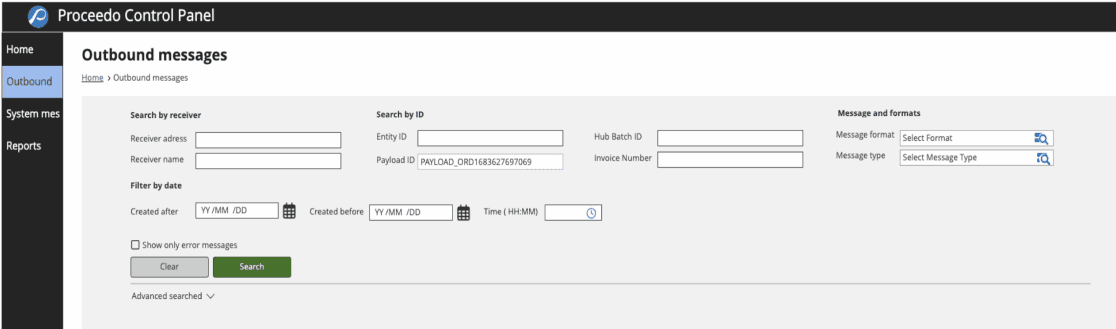
Smart button for ease of access.
After the user enters their search criteria and locate a file they are going to handle, I explored a manage button to show up when hovering on the file, to indicate that an action is available. This was explored since the previous pains during the guerilla testing regarding unclarity in how users were supposed to handle the file and see the drawer.

Side drawer
When a file is being managed the drawer shows up on the right hand side of the users screen.
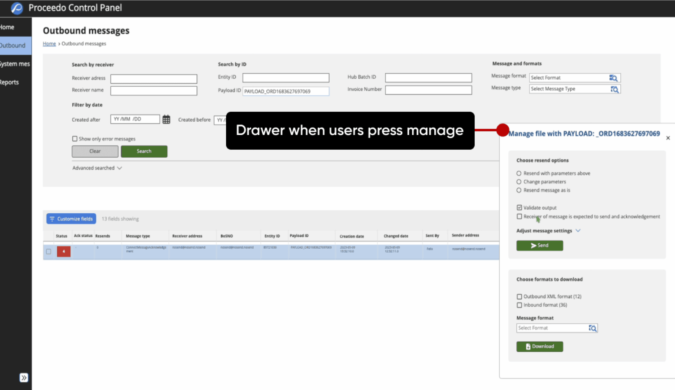
Filtering options
Customizing fields in the table row was during the guerilla test appreciated but not fully clear how it should work. Therefore I made the button more prominent and a clear view in a drawer showing what fields are showing.

Turning concept into reality
Having gathered both feedback and insights from users this early, I could now refine the sketches and turn them into LO-FI wireframes. I conducted 5 usability tests.
Why is this the best solution for the users?
The proposed design enhances user efficiency and productivity, directly improving their work experience. This, in turn, creates value for the organization by streamlining operations and enabling more effective file management, ultimately supporting the company’s growth and performance.
usability testing
Ensuring I solve the right problems
My primary goal at this stage was to validate whether the design solution was well interpreted and if the users would save time and result in a more efficient workflow. The testing was also done to make improvements.

The problems
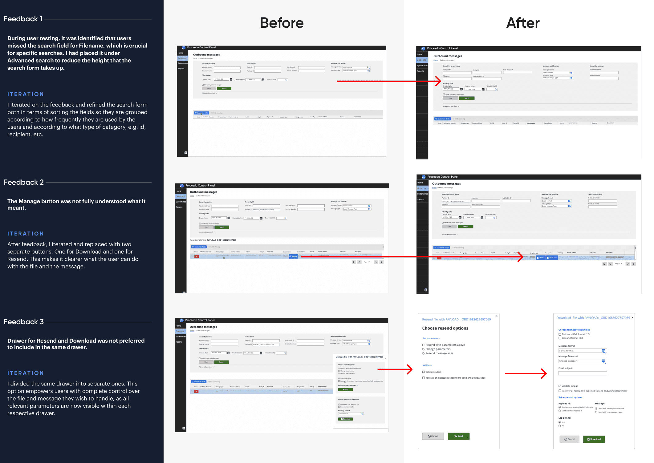
Based on feedback there were three areas that were not clear to the users which resulted in a round of iterations which helped me refine the solution. Participants responded well to the concept as well as the new developed flow. However there were some things that was not so clear to the user.
1
Search form missed info

2
Misplaced and unclear CTA

3
Drawer actions created confusion

After testing I summarized the main insights and proceeded with iterations for improvements.
solution
Final results
The concept was very well received from the users. After the rounds of usability testing, I was confident that the proposed solutions were going to improve the user experience for the users.
Structured search form
With an improved and structured search form the scannabillity and parasability have been improved for easier navigation.

Improved efficiency
Allowing users to filter the data tables we ensure they can create their custom view that cater to their different needs and workflows.

Drawers for smarter file handling
Allowing users to handle files efficiently while remaining on the main page keeping a clear context.

Impact
Results & Outcomes
Users own words
The concept was well received during usability testing. Users found the experience intuitive and appreciated being able to manage files, such as downloading or resending without leaving the page. The simplified flow, with fewer steps and clicks made tasks feel faster and more efficient. To support this, here are some direct quotes from the testing.


What it means in practice
The optimized resend and download process which when developed would reduce handling times by up to 45% compared to the current flow. Increased versatility and customization through filtering options boosting work efficiency. Redesigned the UI to create cohesiveness resulting in fewer clicks, a more intuitive page and navigation structure.
Future roadmap
After my handover to Proceedo they were very thankful for the discovery that I did in this short amount of time. The proposed solution is being refined and tested so that it can be developed for the new Internal pages.
Tracking success
To dig deeper into the outcome of the solution, I would like to measure the actual success of the new designed product. Measuring users time on a task to A) resend a file and B) download a file, compared to its current time.
What I would have done differently
Having more than 10-weeks, I would definitely do another round of usability testing to gather more insights to validate, iterate and refine the solution. By doing this I could potentially explore more problems with the concept I created.