Electrolux
From consideration to conversion. Fixing the moment shoppers decide.
Role
Product Designer
Platform
Web
timeline
Oct 25' - Apr 26'
skills
Product Design, Product Strategy, Prototyping
team

General (2)
Price
1195 €
995 €
1195 €
Stock
In stock
Low stock
In stock
Rating (1)
Rating
4.9
3
3
Dimensions (3)
Rating
4.9
3
3
Compare products
Show differences (23)
EOF6P46X
4.9 (40)
EOF6P46X
3 (40)
EOF6P46X
3 (40)
"I feel confident choosing now. If something's marked, I know it's a difference"
User feedback

The problem
Everything about comparing worked against the decision.
Users had to leave the product listing pages to compare, then landed on a new page that showed everything and prioritized nothing. At both points the experience added effort and friction.
Comparing meant leaving the Product listing page.
The comparison is a strong conversion lever. People who compared converted around 6X more than those who didn't. Yet reaching it meant leaving the product listing behind, giving up filters, scroll position and momentum.

Reaching the compare page
Reaching the compare page, several issue and opportunities were identified. Users scrolled back and forth, trying to figure out what actually separated one product from another.

Too much to scan, nothing to guide them
Every spec had equal weight. There was no way to scan for what mattered without reading everything, so people couldn't tell differences apart and slowed them down.
50% dropped off before the tool could help
Half of all users abandon the comparison before reaching the end, before the tool could help them decide anything.
The difference were hidden
The comparison had a "Show differences" toggle meant to highlight differences between products, but it was off by default and easy to miss. Most people never switched it on, so the product specs just looked identical.
research
The tool showed everything, but explained nothing
Usability testing made it concrete, the tool created confusion exactly where it needed to create confidence.
A bloated list that buried the answer
Comparing felt tedious. A long, dense list added noise, not value, and left people with no idea what to focus on
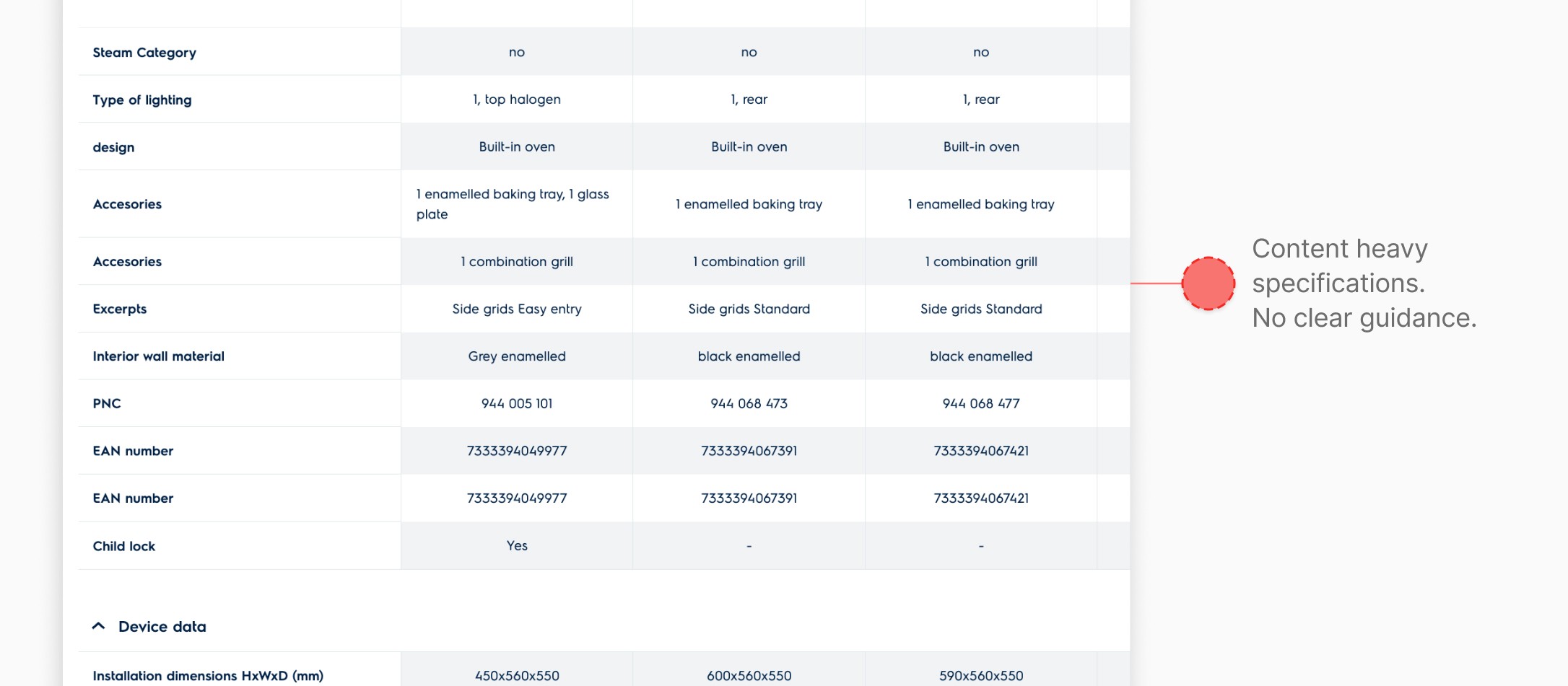
The comparison didn't compare
4 of 5 users never found the "Show differences" toggle. the tool's one real value was hidden behind an extra step.

From a wall of data to a single question
How might we make the difference, not the data, the first people see to improve decision making?
Prioritizing by impact, not instinct
Before deciding where to go, together with the product manager and analytics team we mapped what the business needed against the pain points from research. The single highest-scoring opportunity ended up being: highlighting differences and smarter ways to present data.
Effort
Impact
Product manager
Analytics team
Oscar
Feature
Feature
Feature
Feature
Feature
Feature

Highlight differences, Collapse sections
Improve scannability, reduce cognitive load to support decision making.


Designing for improved decision making
With priorities aligned, I framed the redesign around a simple shift, stop presenting specifications that and start supporting a decision. That gave me three goals to design against:
Make differences obvious
If what separates the products is the first thing people see, they should spend less time hunting and more time deciding.
Simplify the decision
If the comparison surfaced only what actually drives a choice, people should reach a decision faster.
Increase conversion
Comparison already converts shoppers at a higher rate than browsing alone. If the friction inside it were removed, more of that advantage should carry through to a completed purchase.
design
Rebuilding the experience to reduce context switching
With those goals set, I started with the biggest lever, not the smallest detail: why send people to a separate page to compare at all? Leaving the category page meant loss of momentum and context.
What if comparison didn't require leaving the page at all?
A modal, not a separate page
I proposed moving comparison into a modal opened directly from the category page, so people could compare without losing their place. It was harder to build but I worked with engineering and the product manager to test feasibility. Keeping people in context was worth the extra cost.
Creating an intuitive and scalable layout
I quickly realized using a modal was limiting the amount of content it could hold while still providing optimal clarity.

After reviewing several layouts, I landed on a structure that balanced priorities with flexibility and clarity, giving me confidence to move forward. The main improvements focused on highlighting differences by default, reorganizing specification lists to surface the relevant information in a logic order.


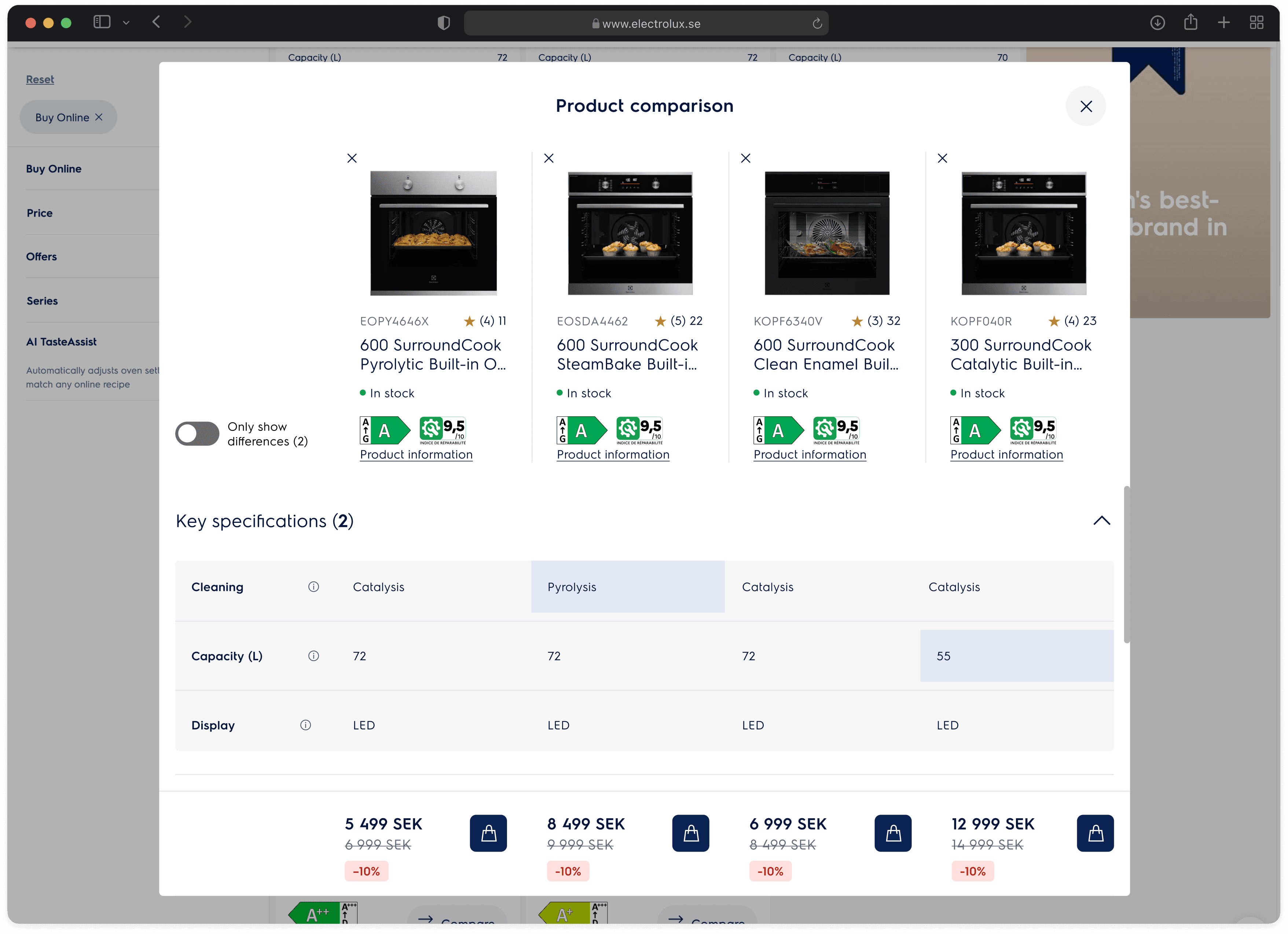
Surface differences by default
To streamline the comparison I enabled the tool to highlight product difference up front. This gave consumers direct identification about differences and a clear side by side breakdown.

High-priority elements are placed at the top of the Modal. The Toggle "Only show differences" is always accessible to filter out all similarities to narrow down the specifications.
Numbers to help scannabiltiy
To reinforce the differences I added a number next to each section header, and a running total next to the toggle, so people could see how many differences a section held before expanding it.


testing
80% found the new structure easier to scan and feedback helped me make improvements
I ran a quick usability session with an early version of the design, guiding them through tasks while gathering feedback. I asked users to prioritize the content based on their needs to better understand what matters most when comparing.
Price and product felt disconnected
Prices and add-to-cart buttons sat at the bottom of the modal, far from the product they belonged to. Participants lost track of which price matched which oven.
Important specs buried too far down
The layout was clearer now, but the order hadn't changed. Specs people actually used to decide were buried beneath ones they didn't care about. Participants had to scroll past everything unimportant to reach what actually mattered.
Highlighting differences by default landed
The moment the modal opened, differing specs were highlighted. Participants noticed it immediately, without being told where to look.
Adding more clarity
The core improvements held up. But testing exposed things the first iteration hadn't solved. All needed fixing before this could be taken into development.
What mattered most was still too far down
The specification order didn't match how people actually compared. Decision-driving content like price, technology, and key features sat below less critical sections.
Solution
Specs are restructured leading with core decision factors: price, technologies, and features that separate products. I also incorporated reviews in a way to to improve purchase decisions.
Price was disconnected from the products
In the first iteration, prices were placed at the bottom of the comparison. Neither was it treated as a comparable feature, so price differences were never highlighted. People expected price to be compared the same way every other feature was.

Solution
Price is now part of the specification list at the top - it's the first thing people sees. Now highlighted like every other feature.
Where comparison mattered most and worked least
Comparison is a strong conversion lever on the site. 73% of traffic is mobile, yet only 36% of comparisons happen on mobile. I focused on improving the mobile experience in several areas to create clarity.
Designing the experience for the device most people actually used
Product images collapse as you scroll, giving more focus on specifications and their differences. The toggle to Show and hide differences always stays in reach.
results
The new compare tool is live for all European markets.
After tackling some of the larger pain points (Simplify decision making, removing friction, reduce cognitive load and loss of context) the new comparison replaced the standalone compare page in every European market. The performance is currently being monitored
General (2)
Price
1195 €
995 €
1195 €
Stock
In stock
Low stock
In stock
Rating (1)
Rating
4.9
3
3
Dimensions (3)
Rating
4.9
3
3
Compare products
Show differences (23)
EOF6P46X
4.9 (40)
EOF6P46X
3 (40)
EOF6P46X
3 (40)
"I feel confident choosing now. If something's marked, I know it's a difference"
User feedback
reflection
The lack of post launch metrics
One of the most important lessons from this experience was challenging the status quo in order to go the extra mile. We shipped without defining success metrics, and that's the thing I'd do differently. The analytics that framed the project gave me baselines to measure against. Id like to measure the share of listing sessions that open a comparison, share reaching the final section against the 50% we started with, mobile's share of comparisons against 36%, and add to cart rates from within the comparison.