Revamping the checkout experience

Electrolux
Transformed a multi-page checkout into a smooth, one-page process, reducing friction and optimizing conversions.

In 2024 Electrolux re-architected its checkout to combat high drop-off rates, long load times and an overly long flow all impacting revenue loss.
I was responsible for the end-to-end redesign, transforming a multi-step process into a streamlined one-page checkout, reducing drop-off rates and boosting overall conversion rates, in close collaboration with product and engineering.
Role
UX/UI Designer
Timeline
Jan 24' – Aug 24'
Skills
Product design
UX/UI
Stakeholder management
User research
Prototyping
Team

+9
1 UX designer, 6 Developers, 1 Product owner
problem area
84% cart abandon the cart, with 40% drop offs.
Electrolux multi step checkout spanning 4 separate steps before completion, resulted in long load times exceeding 30 seconds, high exit and abandonment rates. All of which impacts annual revenue loss. The problems are primarily affected for mobile users, which is around 70% of our traffic.
Analysis showed that around 40% of users drop off during the checkout process, with an overall cart abandonment rate around 84%, driving significant revenue loss.
40% drop off rates
+30s Load times
84% Cart abandonment rates
The goal
"We want to create a smooth best in class one-page checkout journey."
During the project kickoff the team shared with me a major objective was to transition the multi step checkout into a smooth best in class one page checkout. To understand the context better I dug deeper and asked what is defined by best in class, resulting in a clear goal and direction.
Project goal
Decrease drop off rate/exit rates. Leverage smarter cross-sell features embedded with the checkout flow to increase average order value and increase conversion for mobile users.
Objectives
Create a one page checkout.
Increase conversion rates
Reduce checkout funnel drop off-rates.
Enhance the overarching UX by simplifying and redefining the end-to-end journey.
Reseacrh
Inside the drop off: Investigating the why
It was important to me to dig deeper and look into analytics and perform secondary research to understand what problems we currently face and what could I learn from them.
My research phase included:
1
Data analytics containing quantitative and qualitative data.
2
UX audit of current checkout.
3
Competitive benchmark of leading e-commerce stores.
Looking into the data:
40% drop-off during the checkout process
At the start of the project, I was onboarded with secondary research presented by the Product Owner, including data analytics on drop-off rates and interaction challenges across the checkout funnel.
1
High drop off rates
The highest drop-off is seen between the delivery address step and the delivery method step.
2
~ 15% of users return from the checkout to the basket page, creating a costly drop-off point
Users are seen to return to their basket page from the checkout process. When returning they try to interact with the order summary. As a result users lose momentum and about 17% only converts and finalize their order.
3
The checkout steps have long load times resulting in high exit rates.
Users facing high load time have lower conversions and higher exits.
These insights were instrumental in identifying critical friction points and shaping the direction of the redesign.


Checkout drop off analytical data & Load times
With the insights I asked myself, why are customers returning to the basket page and what causes the high drop-offs?
Auditing the experience
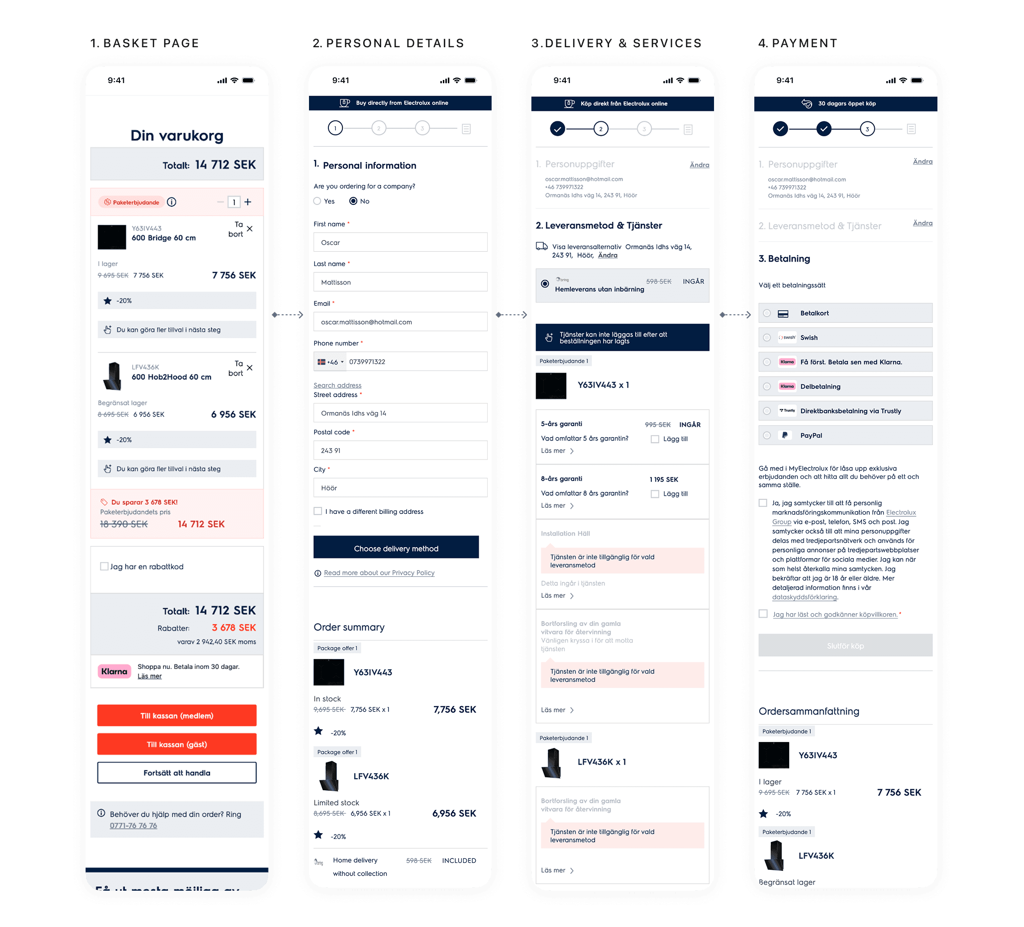
Checkout: Current user flow
1
A long process and Information overload
The checkout process consists of many steps, presents much information simultaneously on a single lengthy page, creating friction and cognitive load.
2
Poor visual hierarchy & user guidance
Critical elements like CTAs and forms lack proper visual emphasis. Makes it difficult for users to understand the checkout flow and prioritize actions, creating confusion about next steps.
3
Inefficient service selection process
Service options are buried within the flow, lacks clear value propositions and included options are not applied by default. Leads to missed upselling opportunities and user confusion.
4
Limited cart flexibility
During the checkout process (after leaving basket page) there is no option to adjust product quantity forcing user back in the flow to the basket page losing momentum and disrupting the flow contributing to drop-offs.
Building on the insights
It was important for me to build on the data insights, I initiated an audit to further understand friction points in the checkout experience and how these could be addressed. My focus was to assess usability breakdowns, cognitive load and user friction specifically within the key steps of the flow.
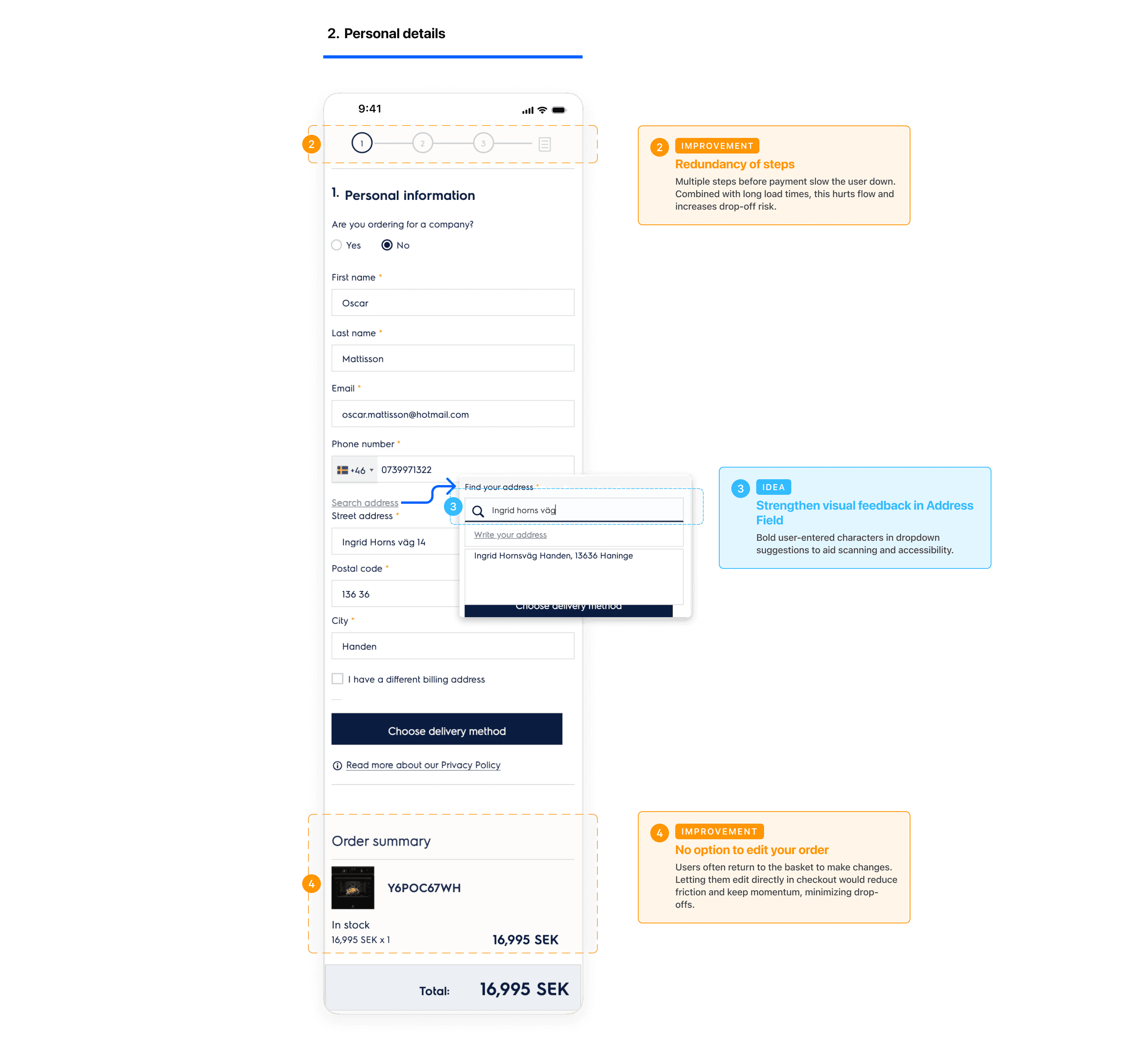
Checkout audit: Personal details
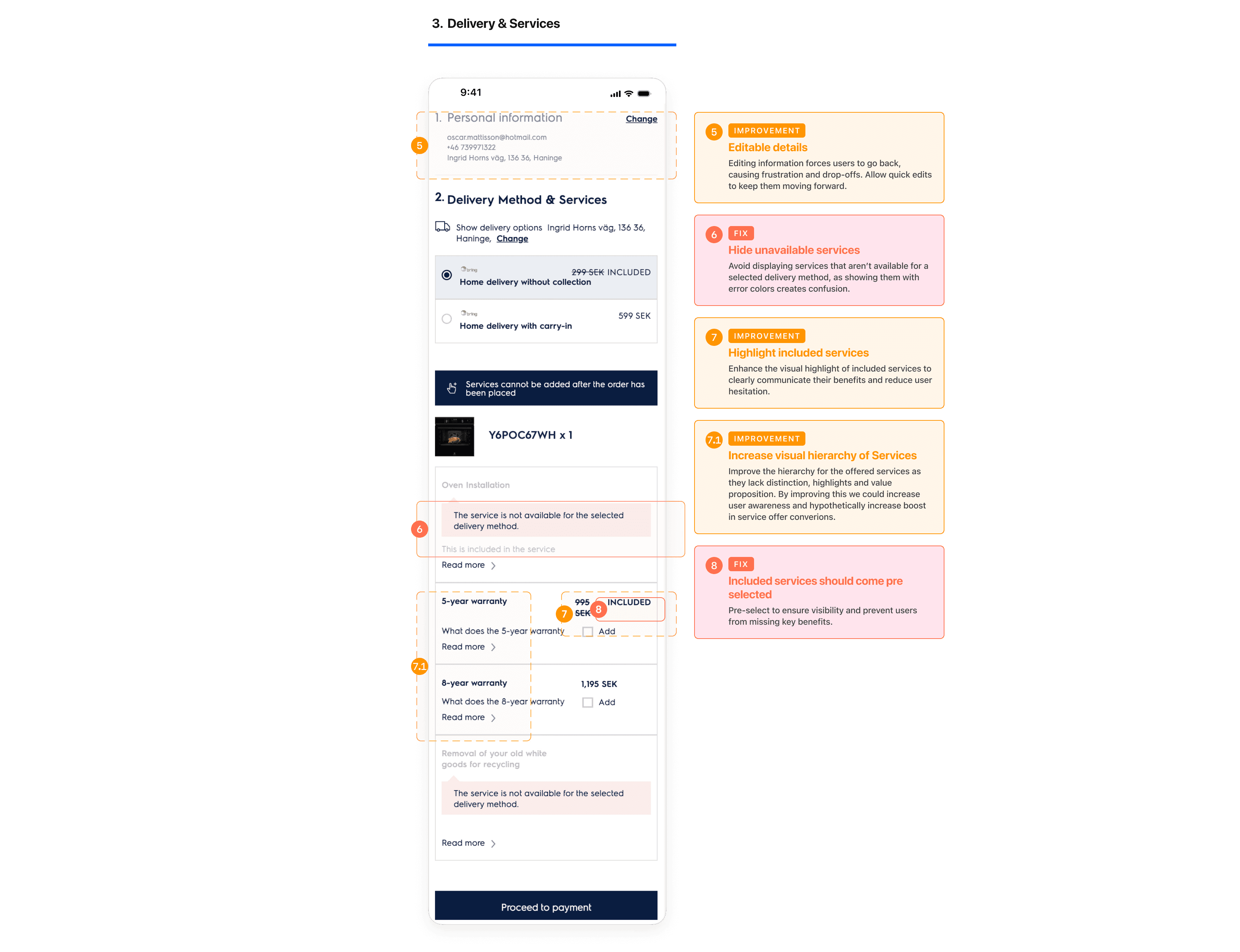
Checkout audit: Delivery & Services
Validating through benchmarking
Competitors balance step by step guidance while effectively minimizing manual input to streamline the experience.
To validate and strengthen my design direction, I conducted a competitive analysis. My focus was on core aspects such as features and flows, that could be utilized to improve the experience, frame opportunities while bridging them with data insights and business goals.
This helped me better ensure that the new checkout experience could also align with user expectations and their mental models shaped by other e-commerce experiences.

Why go back when you can stay?
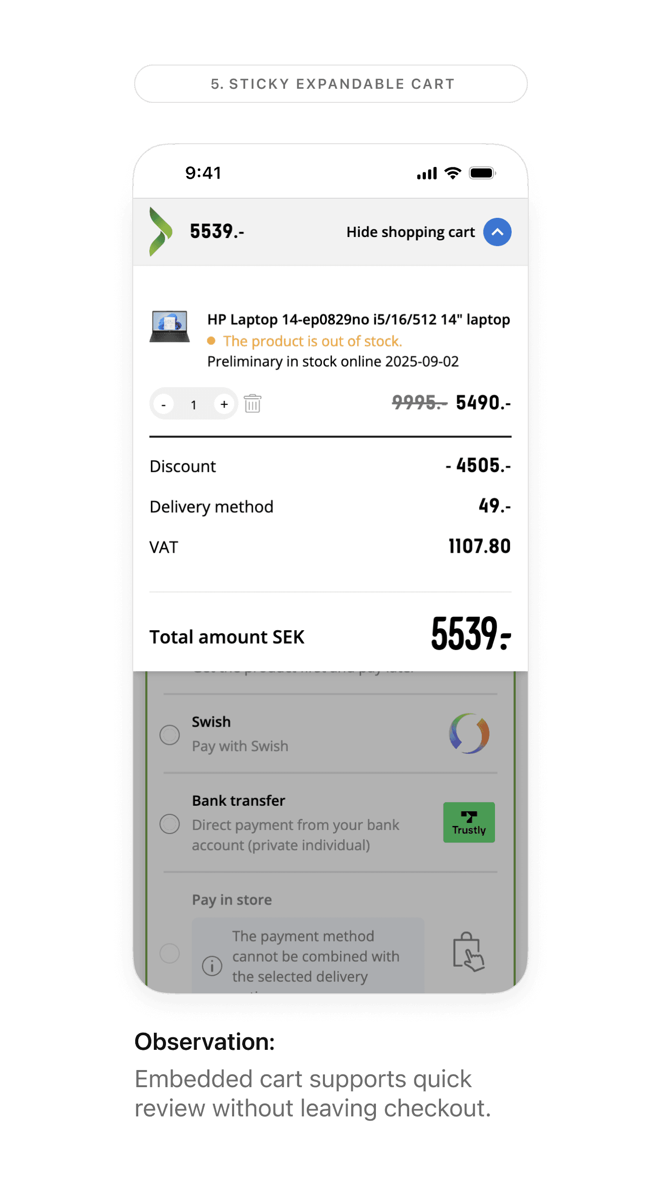
One major finding was the ability to edit the order during the checkout process without the need to return to a basket page or a previous step in the checkout. All in which was eligible through an integrated order summary appearing as a sticky element that could be expanded to edit, adjust and see your products.
This was a key insight that I wanted to further explore how it could be utilized within the flow.
As an early hypothesis I thought it was a strong opportunity that could address the high amount of users returning to the basket page where they instead could handle it all in the checkout process instead.
ideation
Shaping insights into interaction
As a solid foundation had been established I started sketching on a high level flow as a main goal was to transform the multi step process into a single page. Given that, it was important for me to uncover paths and ways forward to understand how the end to end journey would look like.
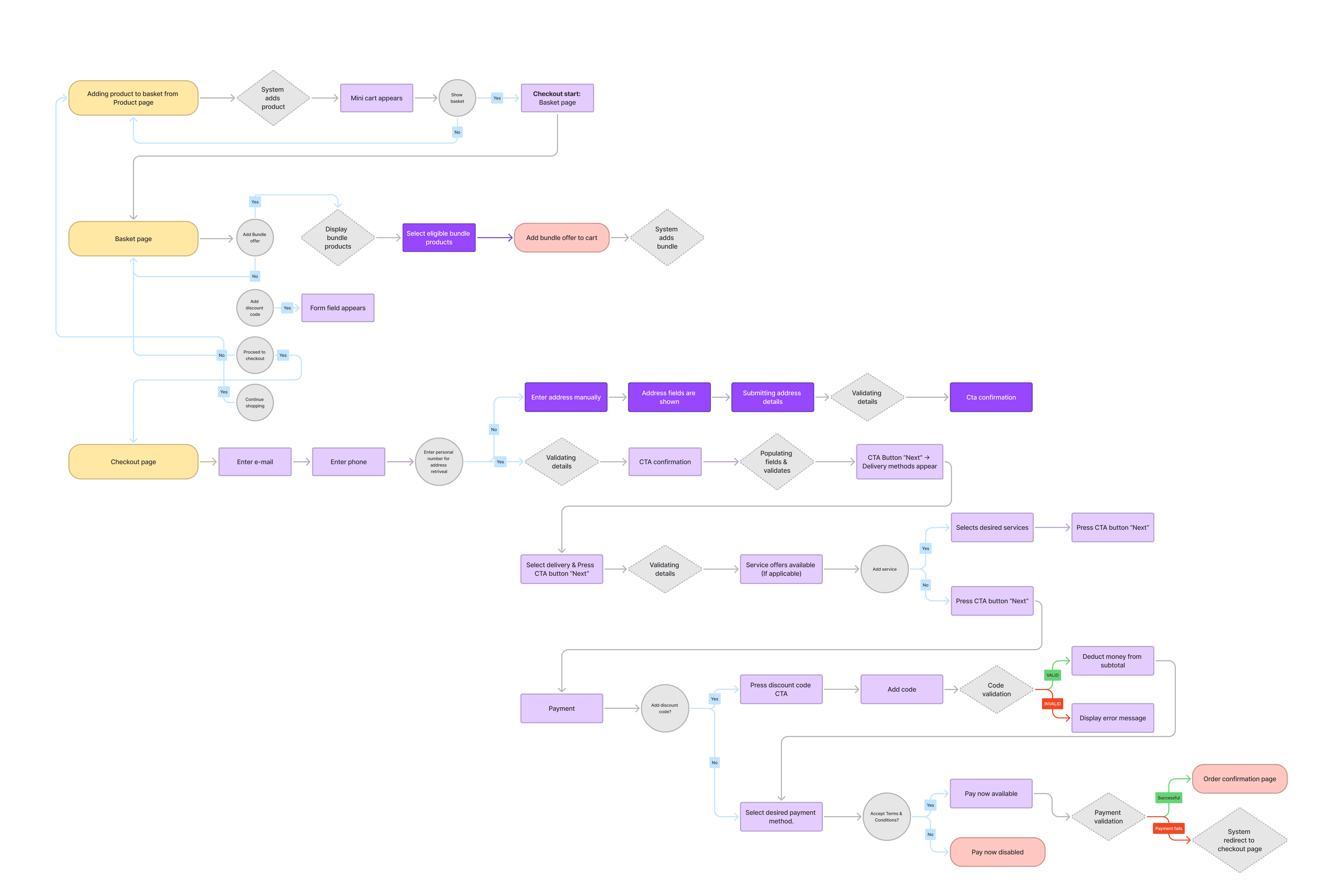
Ideating the vision
As I had visualized a flow for the end to end journey I created two prototype versions. One with a basket page and one without all to understand what solves the problem effectively. I focused on the 4 core checkout steps; Order summary, Personal details, Delivery & Services and Payment. The main goal was to address key usability issues presented in the quantitative insights and how these steps could be improved.
So in relation to the high drop off rates, long load times and a long flow:
How might we help users feel informed and in control without needing to exit the checkout flow?
Early explorations
My design goals: Generate several concepts that ensure solutions aligns with user needs and business goals. I explored several executions on how to help users feel informed and in control without needing to leave the checkout flow.
Given the research, analytics and user patterns, I wanted to validate assumptions around behaviors that: "Users revisit the basket page to make changes to their order due to limited editability and lacking sense of control."
Hypothesis
1
If users can easily edit their orders during checkout, they will feel more in control, leading to fewer abandonments and higher completion rates.
2
Implementing smarter autofill in forms, users will spend less time on manual input, reducing friction and improving checkout speed.
I validate several concepts with my Product owner and engineers to ensure technical feasibility while maintaining focus on user needs and establish a clear direction. Now it was time to explore different executions based on the insights.
Explorations
Minimizing manual input
Collapsable steps, improving sense of progression and simplifying the process.
Drawing from competitor insights, I focused on minimizing manual input for postal retrieval and creating a stronger sense of progression by collapsing completed content as users moved through the checkout.
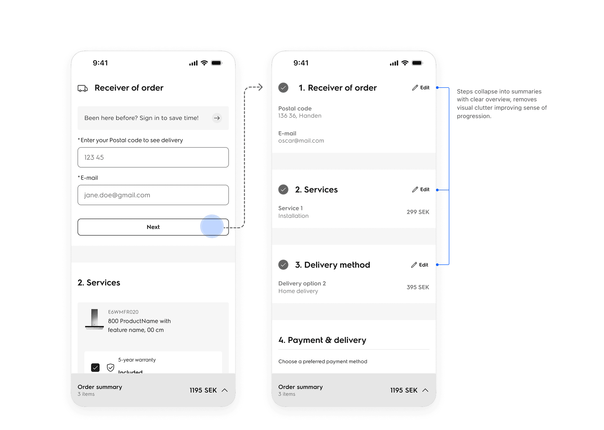
Improve flexibility
Order summary always accessible
Another exploration was to utilize an order summary as a flexible and accessible cart which would represent the current basket page but now integrated in the actual one page checkout flow.
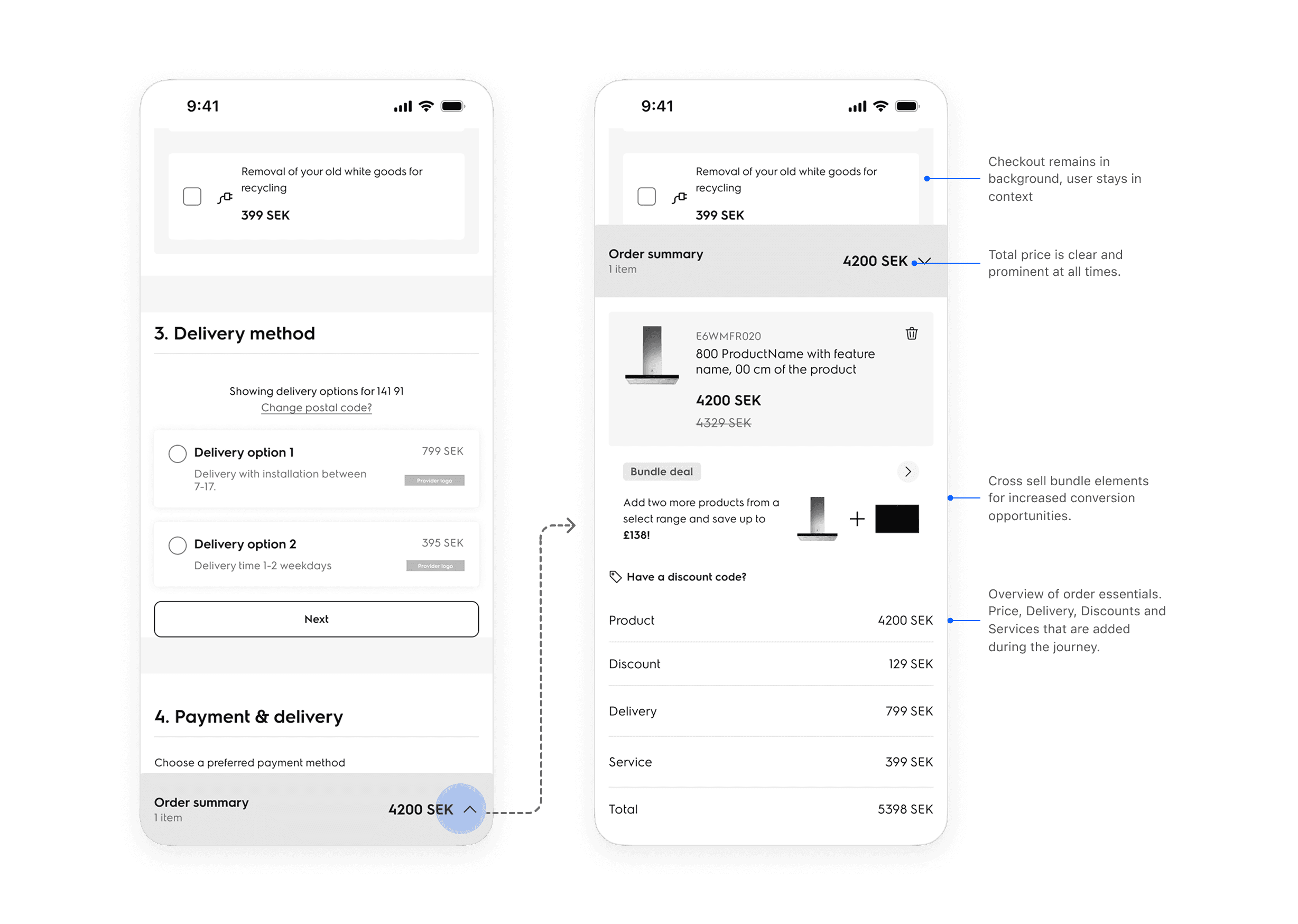
I integrated a bottom drawer containing the users order allowing tracking price, products and flexible edits all in and part of the checkout flow without the need to return to a basket page.
Validation & Testing
From assumptions to proof: filling the gap with guerilla testing
Given the short timeline it was still important for me to validate the assumptions. I want to ensure we are solving the right problems, the right way. Therefore I created a prototype and put it in the hand of the users.
Despite having an established vision with stakeholders, it's a design that had undergone radical changes from a multi step process to now only being a one page. As a result I was able to uncover some further pain points that led me to iterate the design optimizing the flow further.
Key changes
Removal of basket page
Initially I had one version with a basket page and one without. After internal reviews the basket page was decided to be removed, reducing checkout steps even further.
Sticky expandable summary to top of page
Testing showed the bottom placement often got overlooked.
Removed collapsible steps
For selections in the checkout the content remains visible but become progressively visible after selections to reduce cognitive load. Testing uncovered that it was a tedious process to press "Next" after each step causing friction.
iterating
The devil is in the details
I had now undergone several iterations and refinements, aligning with both engineers and the product owner I had now come up with the final stages of the MVP design.
To ensure the product felt as close to final production I adhered the designs to Electrolux SHAPE design system which is the backbone of the redesign. Alongside that I made some small improvements making a big impact.
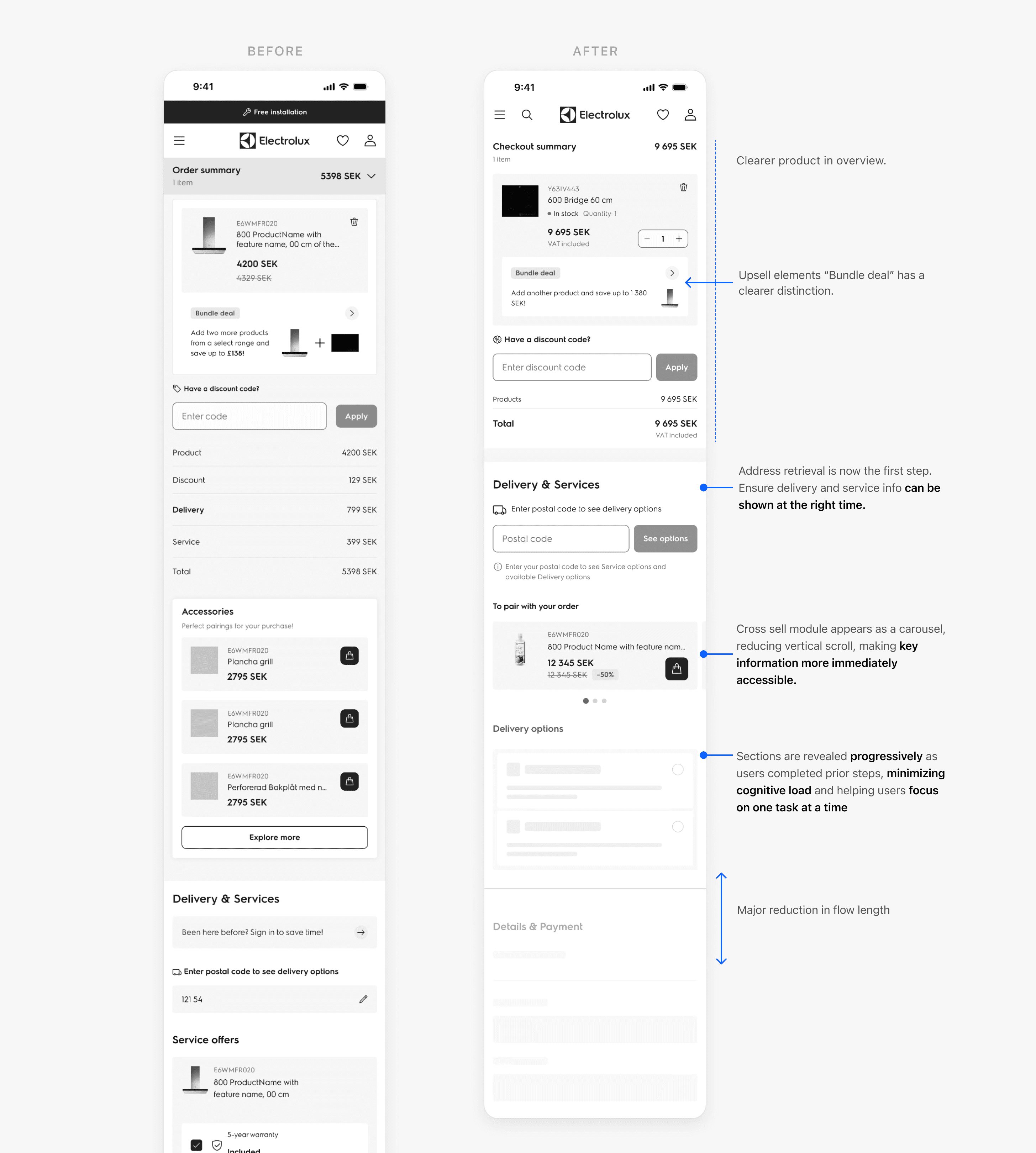
Improved product overview
User's added products received a prominent visual distinction, creating a clearar overview.
Postal code retriveal early in the flow
In order to give users a quick sense of progression, postal code now come early in the flow.
Accessories
Optimized the accessories appearing as a horizontal scroll to reduce flow length.
Progressive disclosure
To reduce cognitive load and perceived friction, content appears progressively as user selects their options. Minimizing cognitive load and helping users focus on one task at a time.
final design
One unified page for reviewing, editing, and completing purchases
My final design of Electrolux's new and revamped Checkout revolutionizes the checkout experience. The new design reduces the the multi step experience from 6 steps, 5 form fields and 7 clicks to a best-case 1-field 1-click flow all in which minimizes user input and friction.
The expandable sticky summary allow users to seamlessly edit their order without leaving the page. All in which address cart abandonment and exit related issues identified at the project outset, by streamlining the process and providing constant support, flexibility and reassurance to users.
The redesigned checkout significantly reduces time-to-completion from approximately 3 minutes and 15 seconds down to 1 minute and 40 seconds. This 53% reduction reflects how the new one-page structure reduces long load times, minimizing manual input compared to the old multi step flow
Improved flexibility
Expandable order summary for flexibility
Data insights had shown, users were returning to the basket page as the live site currently don't offer any cart adjustments after proceeding to the next step of the checkout.
To solve this, I integrated the basket into the one-page checkout, allowing users to view and edit their order, apply discounts, and track pricing—seamlessly and at any point in the journey.
Reduced cognitive load
Progressively content – minimizing cognitive load
To reduce users perceived cognitive load, content displays gradually as the consumer submits their details allowing a better sense of progression while reducing distractions.
Reduced manual effort
Fast checkouts, fewer taps
Integration with third-party providers (Apple Pay, Klarna, PayPal) are eligible as fast checkouts. As a result we can utilize pre-filled user details for a seamless checkout experience, reducing manual effort from users.
Desktop designs
Simultaniousley I designed with desktop in mind. Following the same streamlined experience users have their order summary as a sticky element on the right side giving a clear overview at all times when adding services, delivery or other add-ons.


impact
53% reduction in load times boosting yearly revenue
The checkout redesign recently went live and needs more time to see long term impact. However initial estimates suggest that addressing key pain points could lead to reducing cart abandonment by 5 percentage points, uplifting and increasing the yearly revenue.
As of today we already see a huge impact in load times:
Load times
3 minutes 15 seconds
1 minute, 40 seconds.
Old design
New design
In summary
45%
Reduced completion time
Comparing the new flow with the older 6 step process we've seen a massive drop in completion time.
5PP
Reduced cart abandonments
Initial estimates suggest that addressing key pain points could lead to reducing cart abandonment by 5 percentage points.
Uplift revenue
Increased revenue
Percentage data is confidential and access is restricted to Electrolux only. However with the improvements we estimate a significant uplift in annual revenue due to faster load times, less steps and increased flexibility.
takeaways & next steps
Reflections & road ahead
This project have been very technical under a lot of constraints. One may say that this allow you to work under very restricted circumstance, that is not how I see it. I believe the constraints helped me to push the boundaries. The most challenging part have been to address all pain points and narrowing down to feasible and technical solutions, all in which should balance function and meet business goals within the MVP release.
What I would have done differently?
As an external consultant I believe it is hard to always be involved why certain decisions are made in order to achieve a certain outcome. With that said I definitely would have done earlier and more usability tests to uncover more pain points especially for the final prototype that was done before going into production.
Next steps: measuring impact
Now that the checkout is live, it is the perfect opportunity to monitor the long term impact but also to run usability tests to uncover new pain points and frictions within the flow.
Experience the checkout live
Denmark have the Checkout live and will roll out to more markets gradually.
